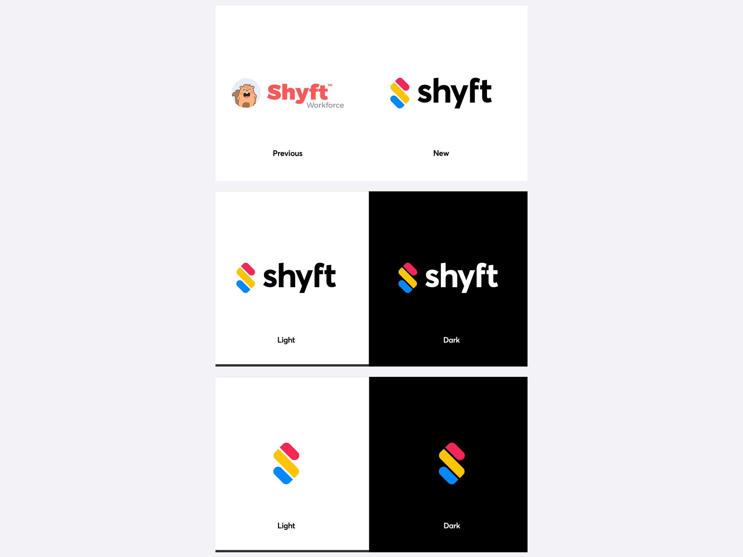
Shyft Brand Redesign
A comprehensive brand redesign was undertaken to align with the new app’s foundation, incorporating distinct shapes, colors, and a custom wordmark to represent Shyft’s identity and values.
Shapes – First, we start with the graphic mark in Square Format to work through the design process and review the intricacy of the objects and shapes. Next, we rotate 45 degrees clockwise to Diamond Format, to complete the logo version that is used and displayed. (Reference Page 4 of Lookbook)
Colors – The prime colors, Red, Yellow, and Blue, are used to create the graphic mark. Opaque prime colors draw attention, and also provide an abstract affiliation with shift statuses in the application such as ‘Open’ or ‘Pending’.
Text – The wordmark Shyft is simple and elegant. The custom font gives each letter character and creates forward motion. A horizontal arc across the top of the word mark centers the logo, and the mark has crisp vertical alignment with the top and bottom of the graphic.
- Chat Interface – In Square format, the chat interface emerges. You will find three chat bubbles modeled after a modern chat messaging interface. The elements interact with each other and create a dialogue exchange. Naturally, the communications component of our application is represented in this type of dialogue.
- Shift Swap – At an abstract level, the first red chat bubble represents a user who needs their shift covered, asking for somebody to cover their shift. The middle yellow segment represents the pending shift object itself. The blue chat bubble represents the second user agreeing to cover the associate’s open shift.
- Calendar Markers – A secondary abstract view, is that these bubbles represent a calendar icon itself, in which the shifts for the month are displayed by the three rows. A visual representation of a ‘loading screen’ view, of a standard calendar icon for a month.
- The “S” – We finish by rotating 45 degrees to Diamond format, where at last you see that the shift and chat bubble components make a perfect abstract “S”, representing of course, Shyft.
Marketing Website
The redesign of the marketing website, myshyft.com, aimed to communicate Shyft’s updated positioning and value proposition, developed in collaboration with various teams to ensure cohesive and effective messaging.

