Shyft is a mobile-first workforce management solution that empowers hourly workers to trade shifts, manage schedules, and communicate with teams.
Adoption and engagement is very high. This decreases absenteeism, reduces turnover, and improves morale.
$10B+ Retail and Supply Chain customers optimize labor, distribute mobile schedules, and engage hourly workers.
Shyft Is Used By 100s Of Thousands Of Users At Nationwide Companies
My Role
As the Lead Product Designer, I was responsible for the strategic redesign of the Shyft 2.0 mobile application. My role encompassed a comprehensive range of responsibilities, from conducting in-depth user and competitive research to the development of wireframes, prototypes, and UI/UX designs. Additionally, I managed the presentation and seamless transition of design assets and sprint deliverables to our engineering teams.
Following the successful launch of Shyft 3.0 in 2021, we witnessed a dramatic increase in the company’s financial performance and in app usage metrics.
We saw a ~30% increase in approved applicants, ~35% increase in shift coverage rate, and ~14% increase in community messages sent.
The company also saw a 156% boost in revenue and growth rates, alongside significant improvements in both recurring and overall gross margins and profits at 194% and 160% respectively. These outcomes underscore the transformative impact of strategic design on business metrics.
2021-2022 Business Impact
Revenue & Growth Rate
+0%
Recurring Gross Profit
+0%
Gross Profit
+0%
Background & Opportunity
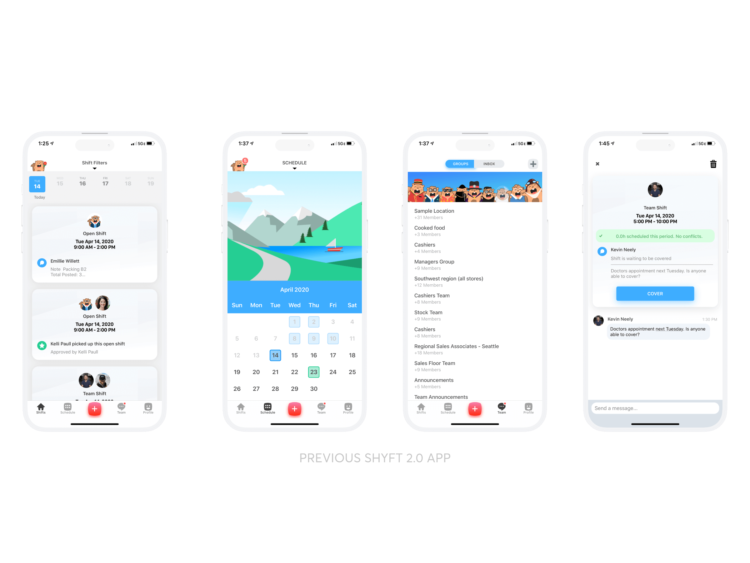
Before the redesign, Shyft had a strong B2C orientation, characterized by a consumer-friendly brand identity and the use of a company mascot, Shiffy. However, the onset of the COVID-19 pandemic brought unforeseen challenges, particularly affecting our primary retail customer base. Faced with these challenges, we made a strategic decision to pivot towards a B2B model, focusing on the enterprise and supply chain sectors. This pivot necessitated a complete overhaul of the Shyft 2.0 application to better align with the needs and expectations of a B2B clientele and to accommodate the addition of enterprise-level features.
User Research
My approach to user research was multifaceted, tapping into the wealth of insights provided by thousands of existing Shyft users. Despite the constraints of operating within a startup environment, I employed surveys, gathering user feedback to pinpoint user pain points, understand user expectations for improvements, and gauge desires for new features.
I was also able to leverage user feedback obtained by our CS team through various channels including implementation calls, account management calls, customer onsite visits, the support queue, annual user surveys, and our main requests/feedback” sheet to make informed design decisions.
Each piece of feedback was then categorized to identify recurring themes and user requests.
I learned that the 3 main improvements users reported were:
A greater relevance in shift offerings. Users conveyed they were seeing a lot of shifts they were not eligible for.
A less cluttered main feed. Shyft 2.0 had a feature where users could post “Pick Up Shift Requests” which was displayed as a card in the feed indicating that user was looking for work. However, there was no way to offer your shift to that user. Coupled with all other shift types, users had no clear way to view their own schedule and frequently were overwhelmed and confused as to what they were looking at.
More details on each shift. Shyft 2.0 displayed very minimal details on each shift. Users wanted more information so they could make an informed decision.
Competitive Research
Given Shyft’s unique market position, our competitive research aimed to identify design frameworks that could elevate our app to match the professionalism and sophistication of leading apps in the market, applying these frameworks and customizing them to meet our needs and designing a professional, clean and user-friendly design our stakeholders envisioned.
Utilizing resources like Mobbin Designs, I sought inspiration from a variety of successful iOS/Android and web products, aiming to adapt and apply these proven design principles to meet the specific needs of Shyft and its user base.
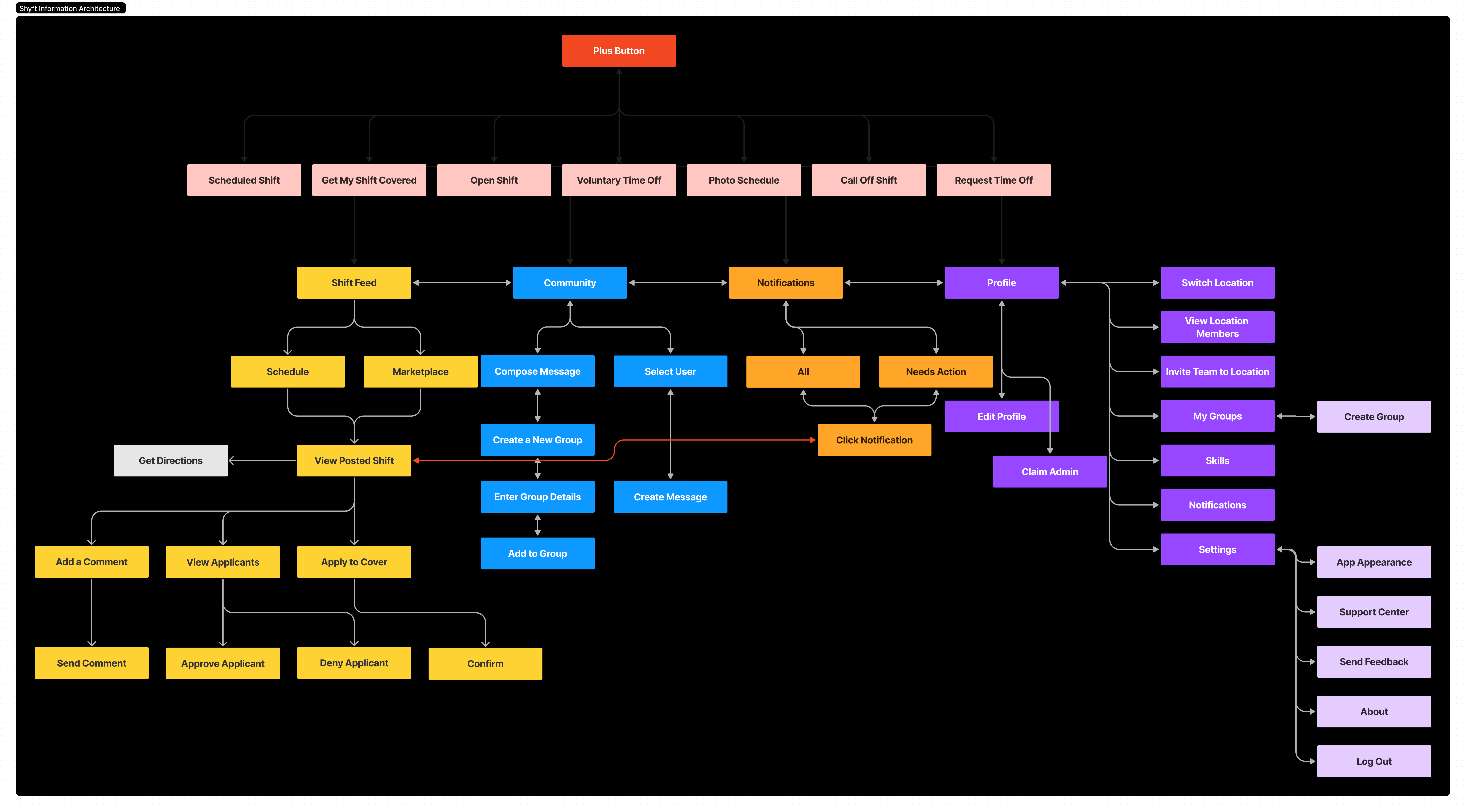
Information Architecture
Rapid Mid-High Fidelity Iterations & Prototyping
This particular design process was characterized by rapid iteration and prototyping, necessitated by the urgency to adapt to company/user feedback and evolving requirements amidst a global pandemic. This phase involved close collaboration with my CEO, who served as the Product Manager, to ensure each design iteration aligned with our strategic objectives and user needs.
I tested multiple assumptions and foundational formats of the shift details view and prototyped each iteration using Invision to conduct user testing.
The first iteration utilized a singular card view with a floating tab on the top right to toggle between different detail categories. After prototyping and testing, we found many users glanced over the buttons and were not aware there were more details to view.
The second iteration showcased all the relevant details on a singular page, where the user could tap into and view expanded details in a linear, “forward/backward,” flow. User feedback indicated there were too many clicks and the information hierarchy could be improved. Users stated they wanted to know the shift date, time, and job title.
The third iteration improved the information hierarchy and I reduced the amount of needed clicks to obtain more information by displaying it in a categorical display on the shift detail view. User feedback improved, however, there was no way to view their own applicant details to compare with the shift details.
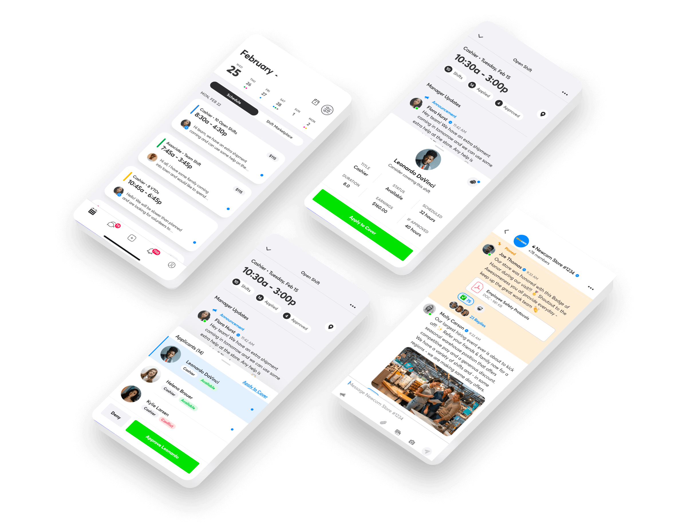
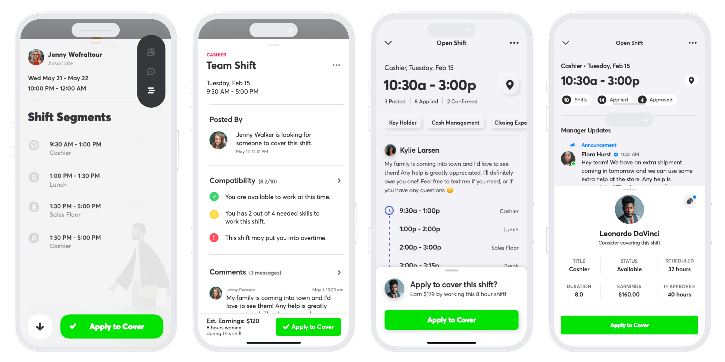
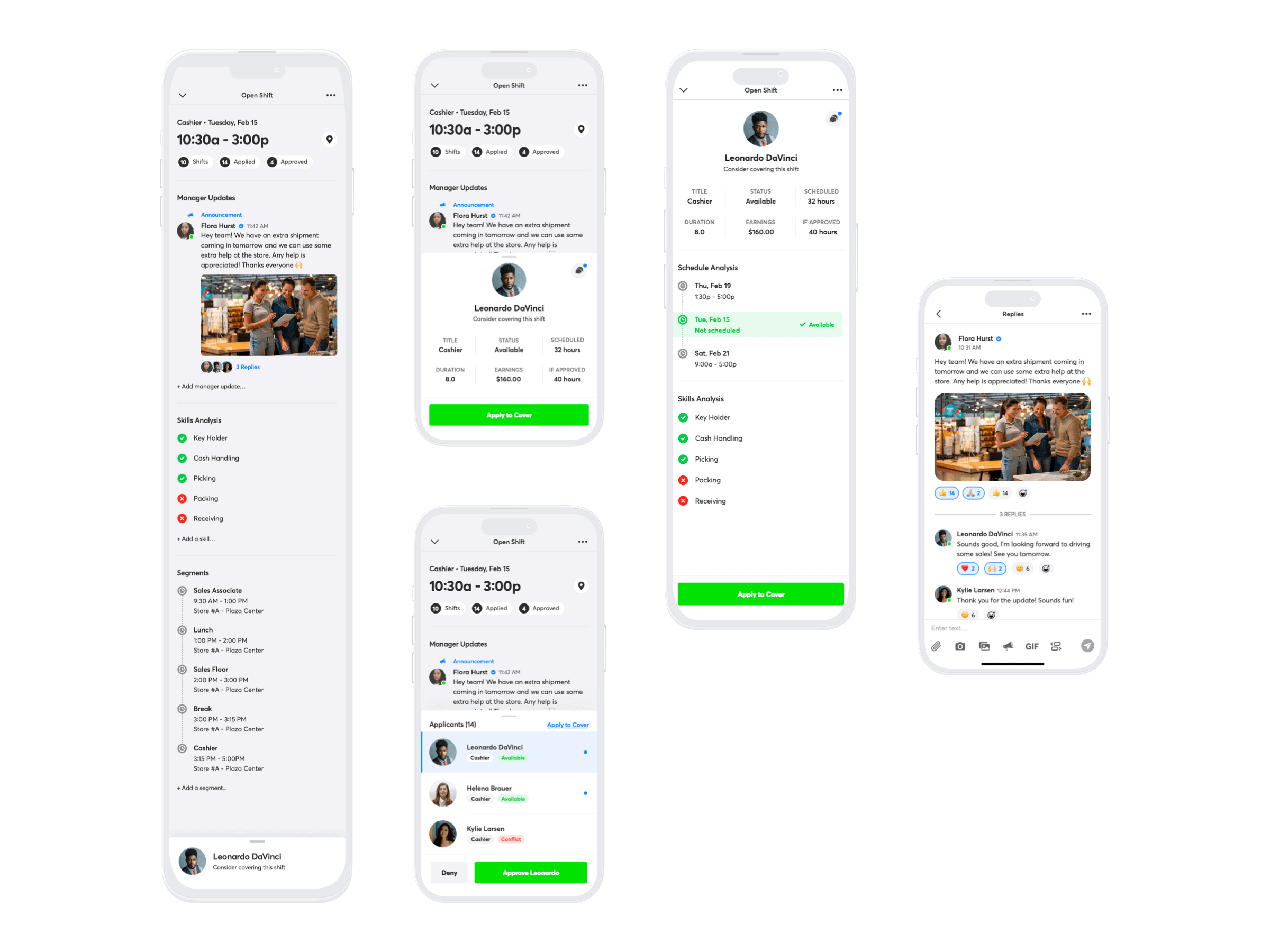
The fourth iteration introduced the versatile bottom sheet, which can be collapsed, half-screen, or full-screen by swiping up. This allowed users to view all relevant information with the least amount of friction and without having to leave the screen. User feedback improved and this was the design we ended up using.
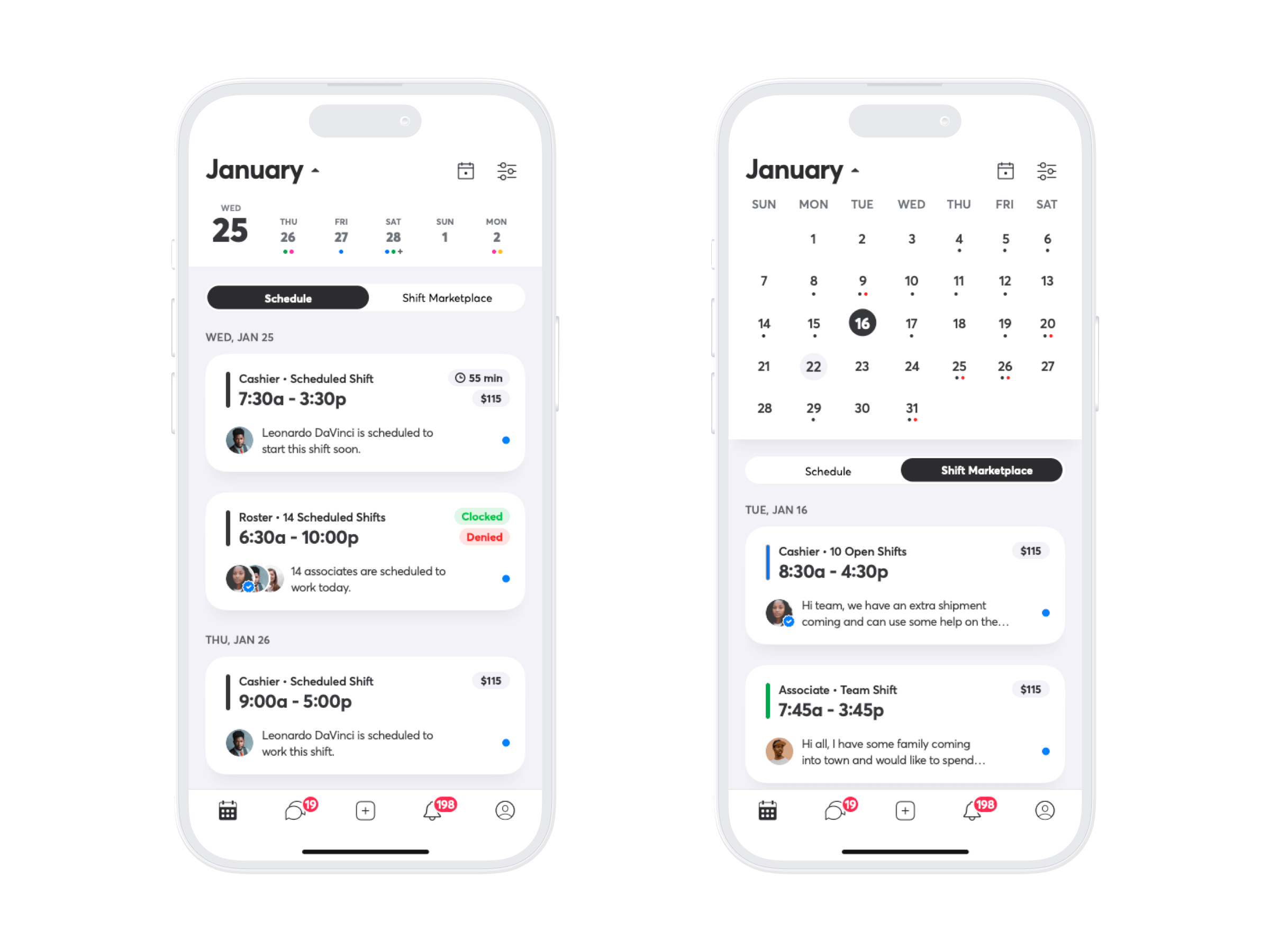
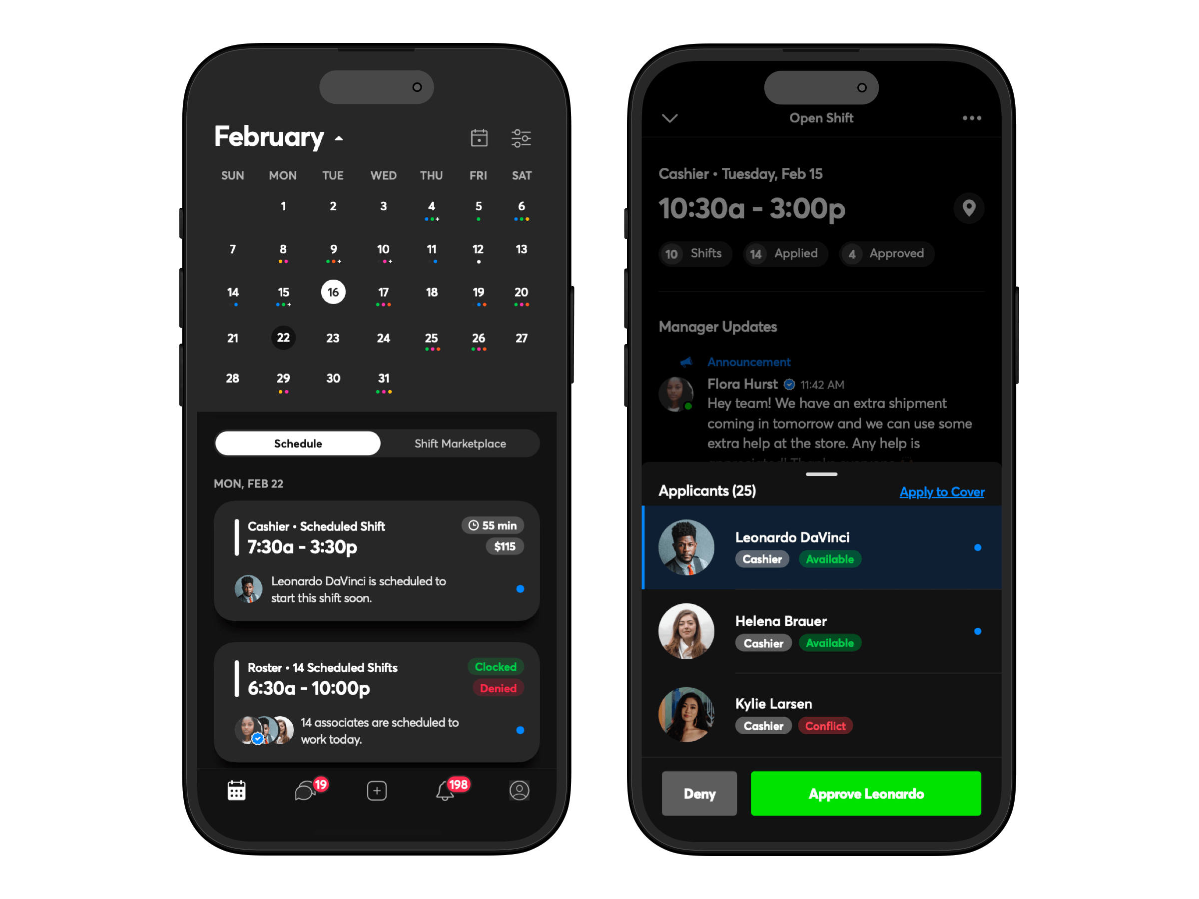
Schedule & Shift Marketplace Tabs
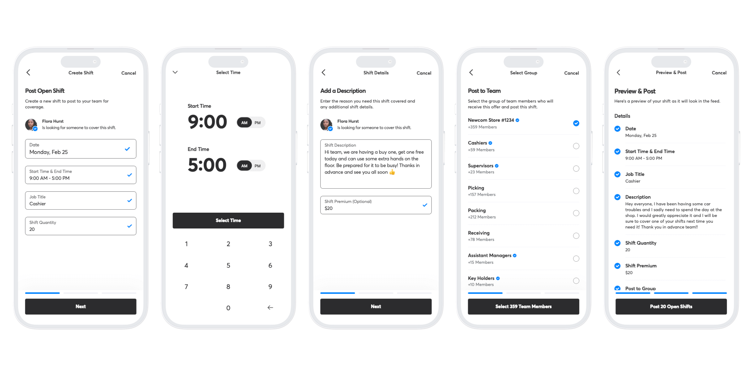
In direct response to user feedback, I introduced dedicated tabs for the Schedule and Shift Marketplace. This decision aimed to streamline the user experience, making it easier for users to navigate the app and access relevant information and shifts. The Schedule tab provided a clear view of personal work schedules, free from the clutter of unrelated content, while the Shift Marketplace tab offered a centralized location for browsing and applying to cover available shifts.
Having gone through countless iterations, I landed on a card-based feed where each card represents the different types of shifts while displaying the minimum amount of relevant information a user would need to know to decide if they were interested or not. With 6-7 different types of posts, I wanted to create a card foundation where the information on the card could work for all post types.
Once the tabs and new shift feed were implemented, we saw an increase of nearly 35% in shift coverage rate.
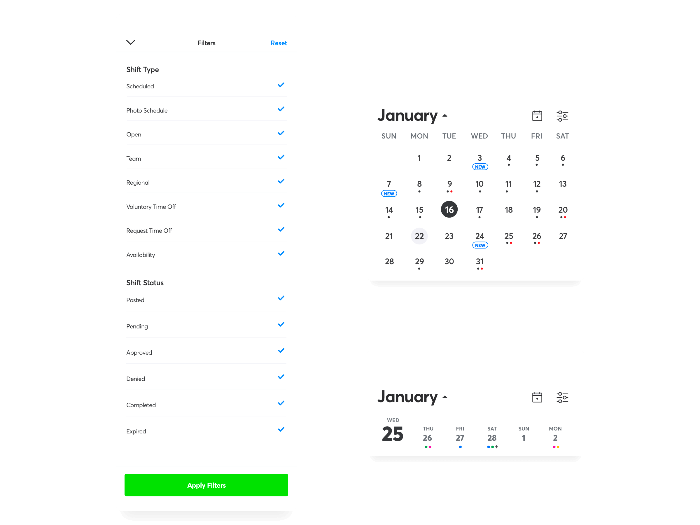
Week/Month Date Selectors & Filters
To solve the user feedback of wanting to find relevant shifts, I added weekly & monthly date selectors that let users quickly glance at what shifts & types were available. As each shift card has a unique color stripe to indicate type, these colors were used on the date selectors to enable users to get a high-level view of what is available at a glance.
I also added additional filters to allow users to customize what types of shifts were displayed on their feed. Initially, I wanted to add in more advanced filters including shift start time/end time, maximum and minimum shift duration, and shift tips but due to resource constraints, we compromised with the filters above.
I then conducted user surveys and found that nearly 80% of respondents these additional features helpful.
Shift Details
Figuring out how to show shift details without overwhelming users was a challenge. I wanted to design a solution to display the details of the shift as well as the relevant applicant information. In addition, there would need to be a framework in place to display pending applicants so managers can review and approve/deny pending applicants.
Using what I learned in the product research phase, I developed a versatile bottom sheet overlay that could be adjusted to show varying levels of detail. This solution allowed users to easily compare their information with shift details, facilitating informed decision-making for both applicants and managers.
We saw a ~30% increase in approved applicants and a nearly 35% increase in shift coverage rate.
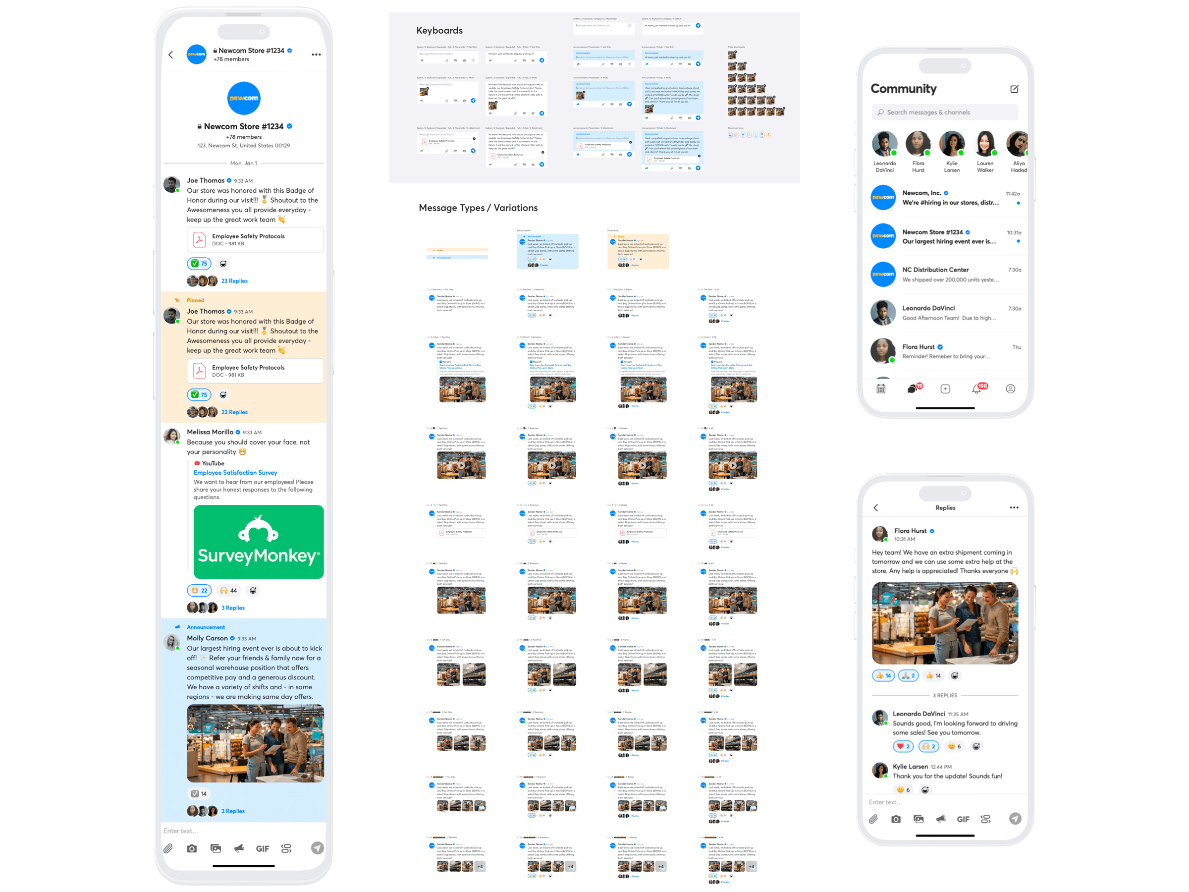
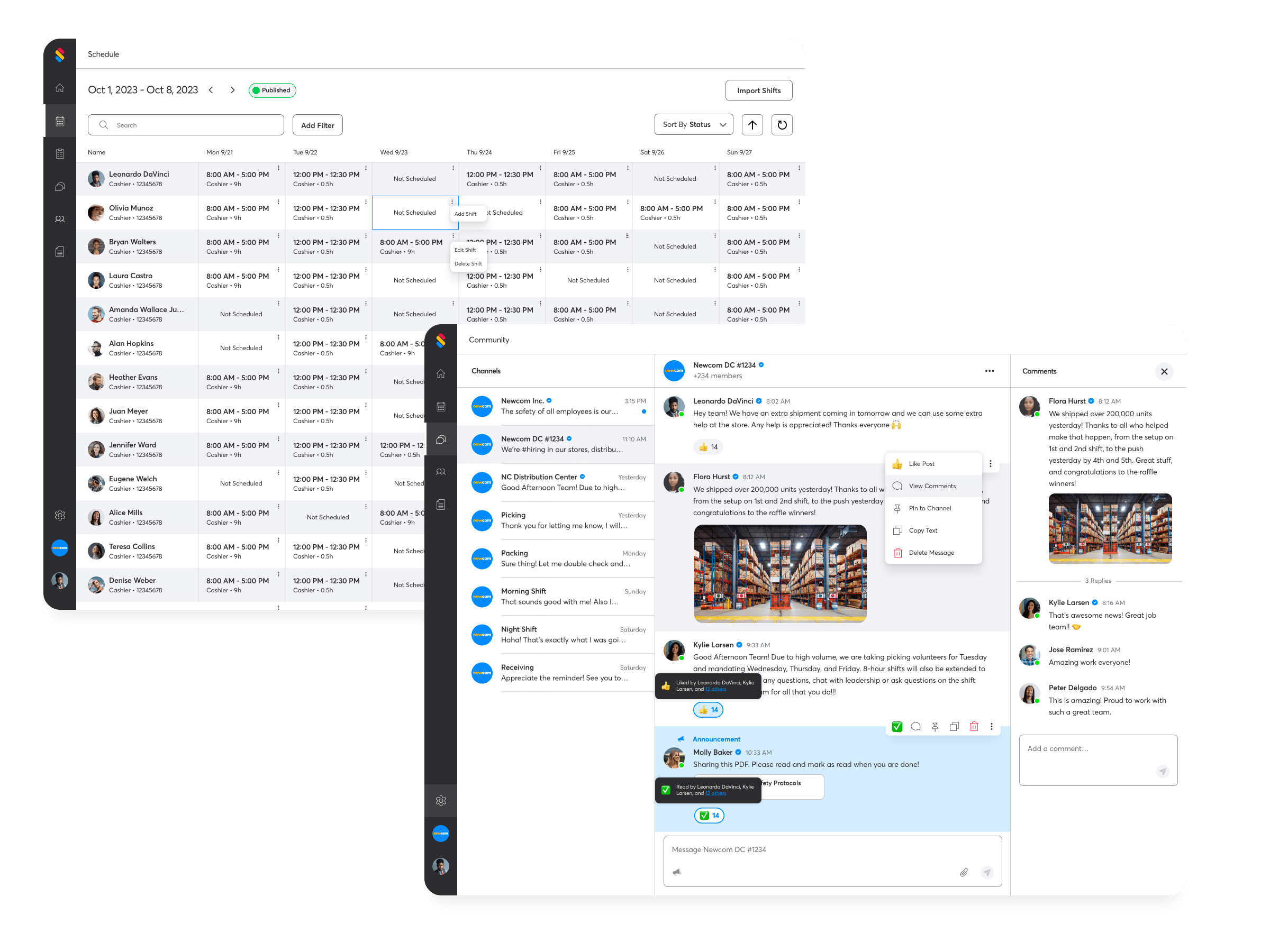
Community
In designing the community features, I focused on essential communication tools such as group channels, direct messaging, and file sharing, ensuring these features were implemented effectively to meet the needs of our users. While I explored the possibility of adding advanced features like polls, surveys, and near-endless file-type support, I ended up compromising with the engineering team to focus our resources on other features with higher impact and lower resources like the ability for managers to send company-wide announcements for important communications.
We saw an increase of ~14% in community messages sent.
Testing & Feedback
The iterative design process was complemented by thorough testing and feedback sessions, involving both internal teams and “power users.”
Comprehensive testing and feedback sessions, involving both internal teams (CS, QA, Engineering, Developers) and, “power users,” who were our existing users who knew the product inside and out, were critical in refining the design and ensuring it met our high standards for usability and functionality. These collaborative sessions provided valuable insights that informed the final design decisions, balancing impact against development effort.
Implementation
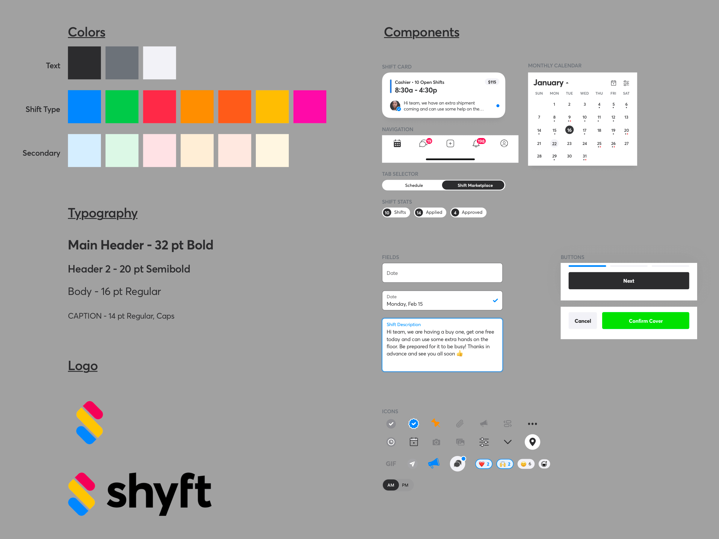
The implementation phase marked the culmination of my design efforts (but I wasn’t done…not even close), transitioning from concept to reality. This process involved the creation of a comprehensive component library, creating reusable text and color styles, and creating detailed documentation in Jira Stories for each flow which ensured a smooth handoff to the engineering and development teams.
Following the release, I worked closely with QA and relevant teams to rapidly solve bugs and feature requests (of which there were many!).
Dark Mode!
I was very excited to work on dark mode. We received user feedback that a majority of the time they used the Shyft app was first thing in the morning after they woke up or before they went to sleep and the app was blinding during those times.
I was able to learn how to best create color and text styles for both light & dark modes to be reusable.
Shyft Manager Dashboard 3.0
We didn’t stop with just the app; we also gave the manager dashboard a complete overhaul, making it easier for managers to keep track of everything without getting bogged down.
Taking the overall framework from our mobile products, I was able to create web-based experiences to deliver robust experiences without the typical constraints of mobile.
Note: I am currently working on a comprehensive case study for this project 🙂
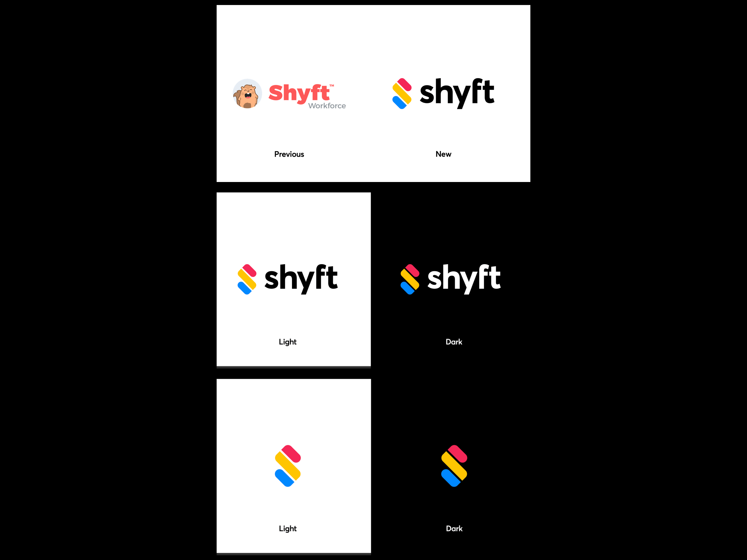
Brand Redesign
A comprehensive brand redesign was undertaken to align with the new app’s foundation, incorporating distinct shapes, colors, and a custom wordmark to represent Shyft’s identity and values.
Shapes – First, we start with the graphic mark in Square Format to work through the design process and review the intricacy of the objects and shapes. Next, we rotate 45 degrees clockwise to Diamond Format, to complete the logo version that is used and displayed. (Reference Page 4 of Lookbook)
Colors – The prime colors, Red, Yellow, and Blue, are used to create the graphic mark. Opaque prime colors draw attention, and also provide an abstract affiliation with shift statuses in the application such as ‘Open’ or ‘Pending’.
Text – The wordmark Shyft is simple and elegant. The custom font gives each letter character and creates forward motion. A horizontal arc across the top of the word mark centers the logo, and the mark has crisp vertical alignment with the top and bottom of the graphic.
Chat Interface – In Square format, the chat interface emerges. You will find three chat bubbles modeled after a modern chat messaging interface. The elements interact with each other and create a dialogue exchange. Naturally, the communications component of our application is represented in this type of dialogue.
Shift Swap – At an abstract level, the first red chat bubble represents a user who needs their shift covered, asking for somebody to cover their shift. The middle yellow segment represents the pending shift object itself. The blue chat bubble represents the second user agreeing to cover the associate’s open shift.
Calendar Markers – A secondary abstract view, is that these bubbles represent a calendar icon itself, in which the shifts for the month are displayed by the three rows. A visual representation of a ‘loading screen’ view, of a standard calendar icon for a month.
The “S” – We finish by rotating 45 degrees to Diamond format, where at last you see that the shift and chat bubble components make a perfect abstract “S”, representing of course, Shyft.
Marketing Website
The redesign of the marketing website, myshyft.com, aimed to communicate Shyft’s updated positioning and value proposition, developed in collaboration with various teams to ensure cohesive and effective messaging.


