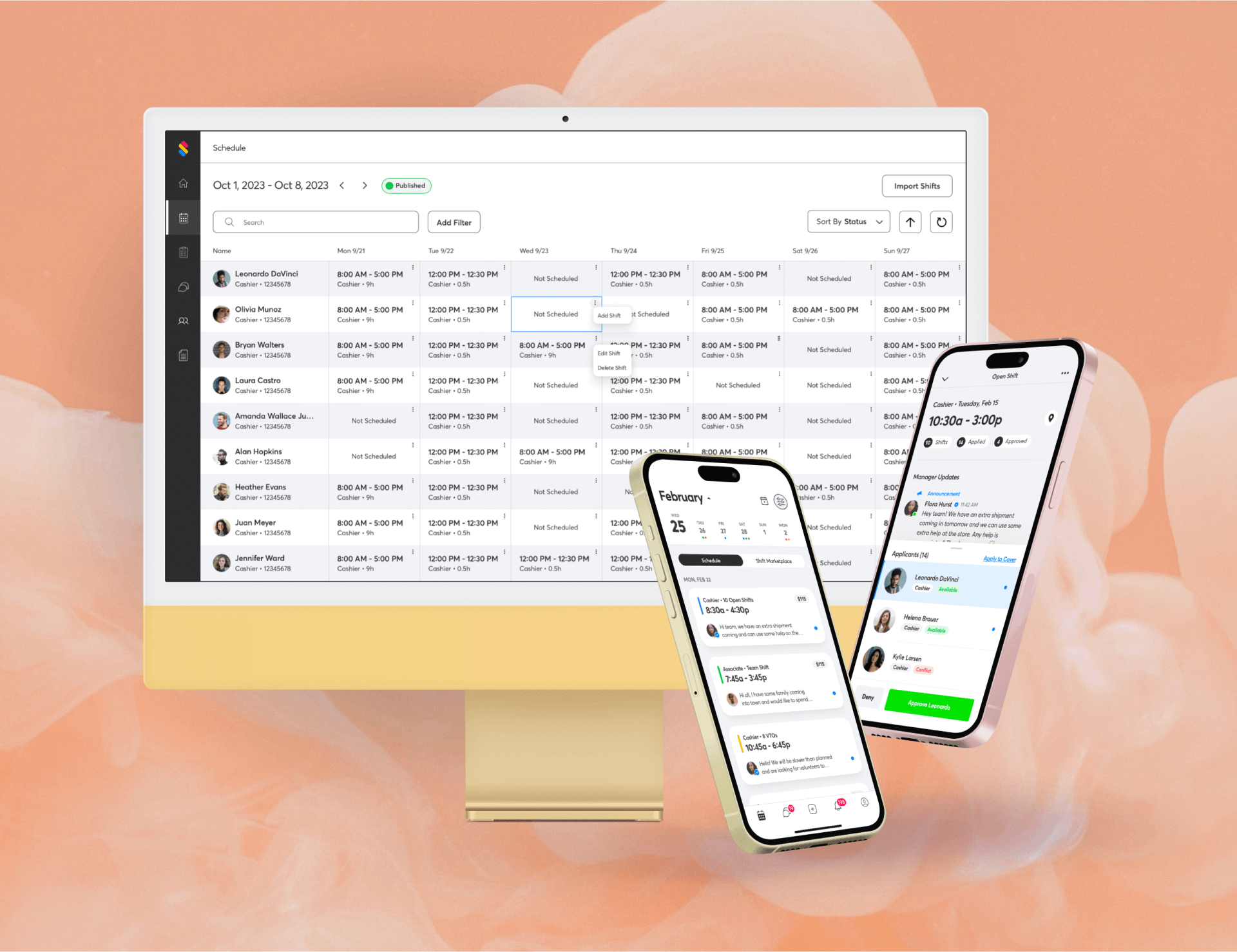
Shyft Technologies
end-to-end mobile & web redesign.
Business Impact
+156%
Revenue & Growth Rate
+194%
Recurring Gross Profit
Measuring Success
+30%
Approved Applicants
+35%
Coverage Rate
+14%
Community Messages
What is Shyft?
Shyft is a mobile-first workforce management solution that empowers hourly workers to trade shifts, manage schedules, and communicate with teams.
This decreases absenteeism, reduces turnover, and improves morale. $10B+ Retail and Supply Chain customers optimize labor, distribute mobile schedules, and engage hourly workers.
- User research
- Competitive research
- Wireframing
- Prototyping
- UX/UI design
- Copy Generation
- Sprint delivery
- Bug fixing
My Role
Shyft Is Used By 100s Of Thousands Of Users At Nationwide Companies

The COVID-19 Pandemic forced Shyft to pivot from B2C to B2B,
necessitating a complete redesign to align with enterprise customer needs.
User Research
My approach to user research was multifaceted, tapping into the wealth of insights provided by thousands of existing Shyft users. Despite the constraints of operating within a startup environment, I employed surveys, gathering user feedback to pinpoint user pain points, understand user expectations for improvements, and gauge desires for new features.
I also leveraged user feedback obtained by our CS team through various channels, including implementation calls, account management calls, customer onsite visits, the support queue, annual user surveys, and our main requests/feedback” sheet to make informed design decisions.
Findings
1. A greater relevance in shift offerings.
Users conveyed they were seeing a lot of shifts for which they were not eligible.
2. A less clutered shift feed.
Shyft 2.0 had a feature where users could post “Pick Up Shift Requests,” which was displayed as a card in the feed indicating that the user was looking for work. However, there was no way to offer your shift to that user. Coupled with all other shift types, users had no clear way to view their own schedule and were frequently overwhelmed and confused about what they were looking at.
3. More details on each shift.
Shyft 2.0 displayed very minimal details on each shift. Users wanted more information so they could make an informed decision.
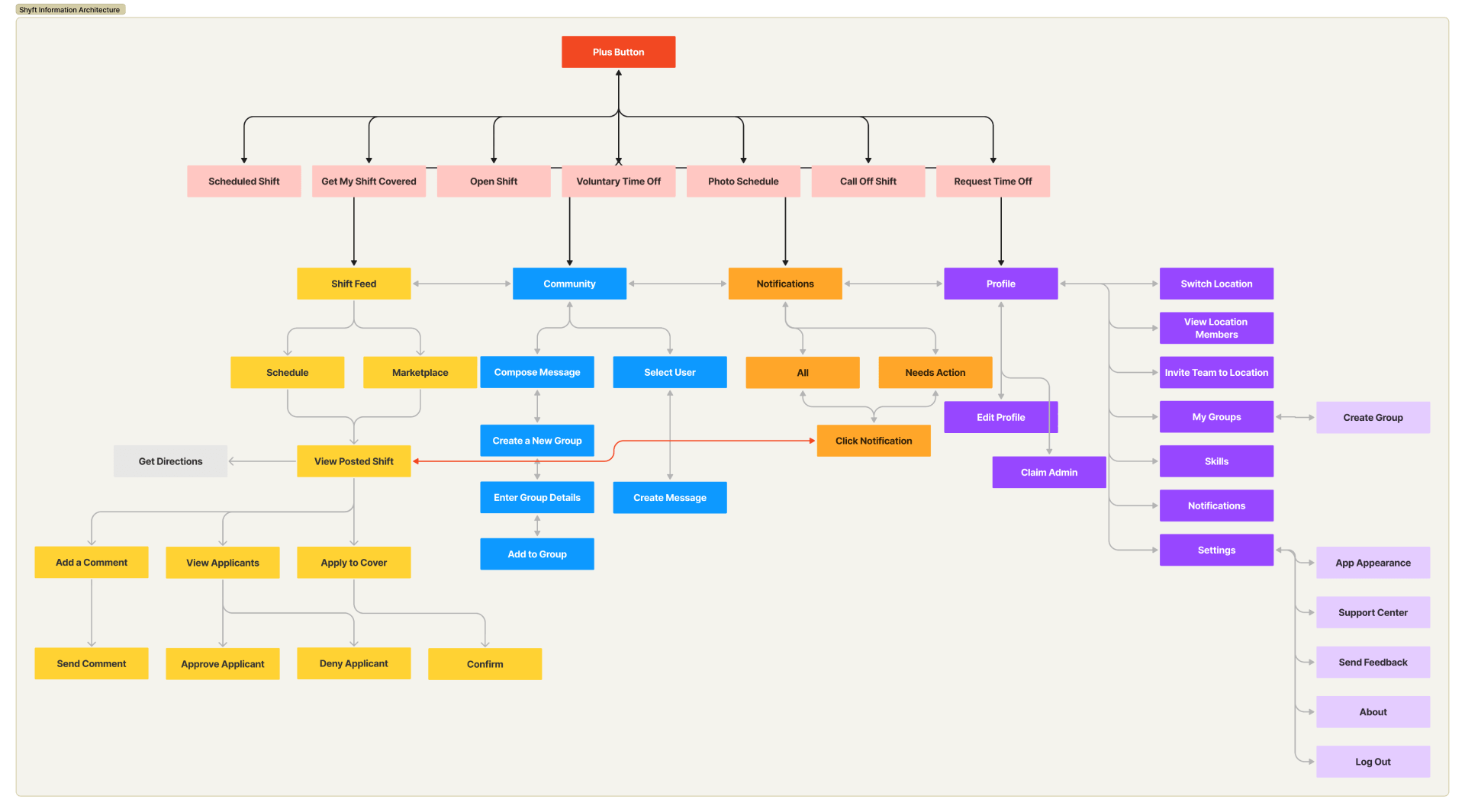
Information
Architecture
Rapid Mid-Fidelity
Iterations & Prototyping
This design process was characterized by rapid iteration and prototyping, necessitated by the urgency to adapt to company/user feedback and evolving requirements amidst a global pandemic. This phase involved close collaboration with my CEO, who served as the Product Manager, to ensure each design iteration aligned with our strategic objectives and user needs.
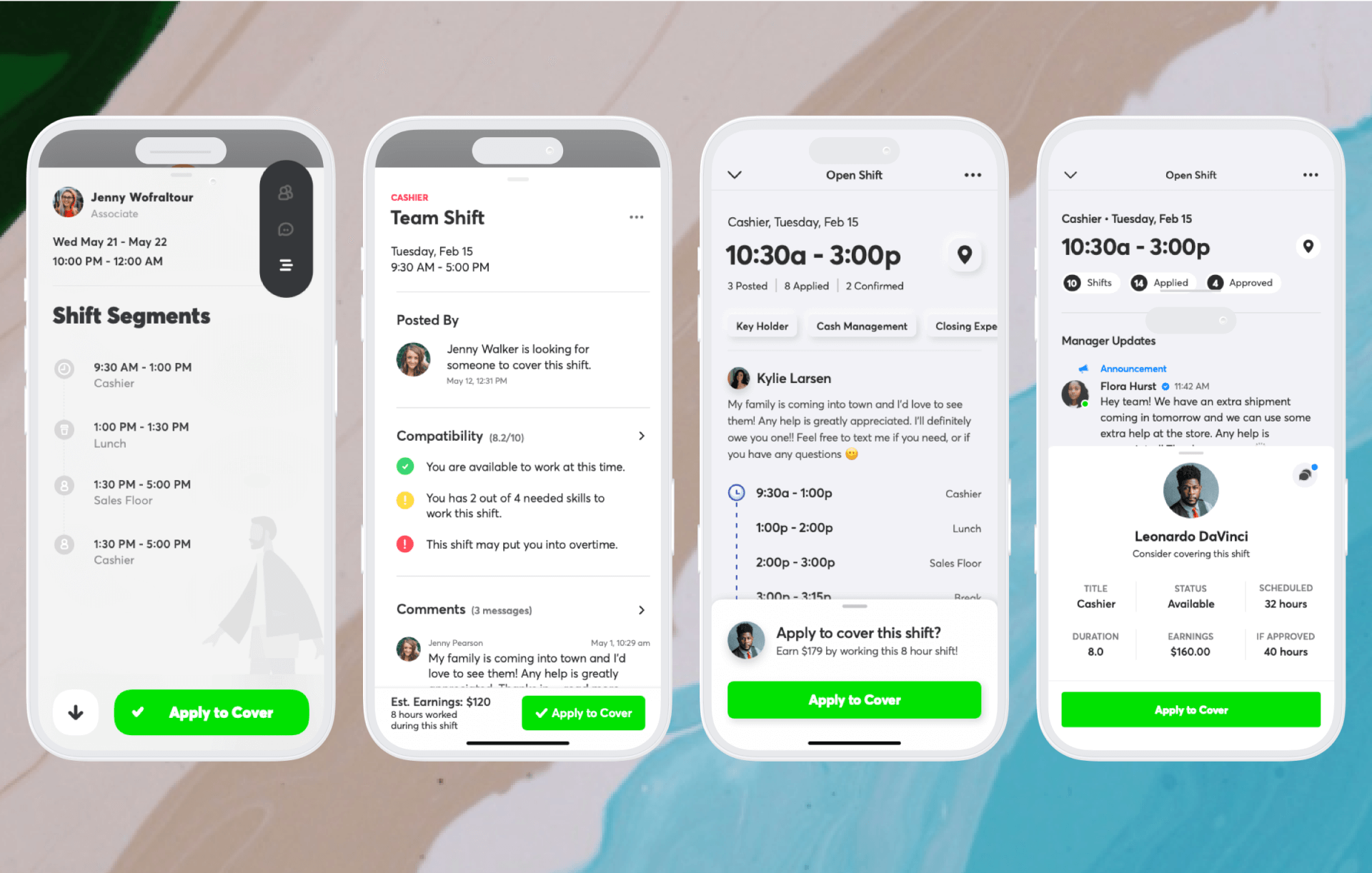
Utilized a singular card view with a floating tab on the top right to toggle between different detail categories. After prototyping and testing, we learned users glanced over the buttons and were unaware of more details to view.
V1.0
I improved the information hierarchy and reduced the number of needed clicks to obtain more information by displaying it in a categorical display on the shift detail view. User feedback improved; however, there was no way to view their applicant details to compare with the shift details.
V3.0
Showcased all the relevant details on a singular page, where the user could tap into and view expanded details in a linear, “forward/backward” flow. User feedback indicated too many clicks, and the information hierarchy could be improved. Users stated they wanted to know the shift date, time, and job title.
V2.0
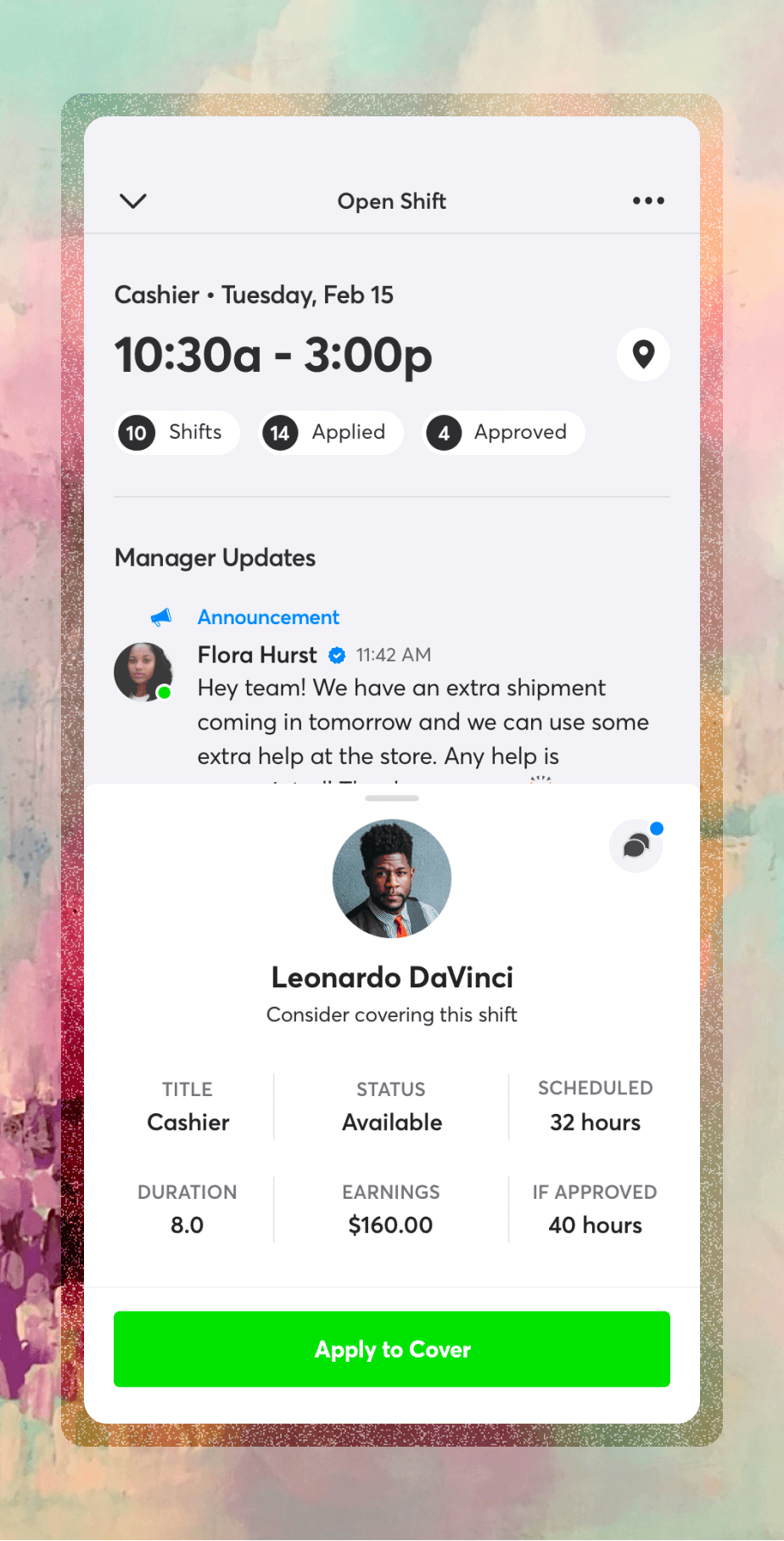
Introduced the versatile bottom sheet, which can be collapsed, half-screen, or full-screen by swiping up. This allowed users to view all relevant information with the least friction and without leaving the screen. User feedback improved, and this was the design we ended up using.
V3.0
Shift Detail Feature
Wish List:
- A solution to display the details of the shift and the relevant applicant information without cognitive overload.
- Framework to display pending applicants so managers can review and approve/deny pending applicants.
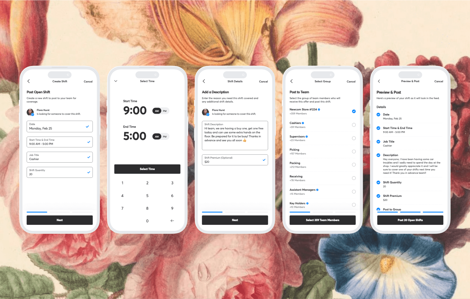
- A simple way to apply to cover the shift.
I developed a versatile bottom sheet overlay that could be adjusted to show varying levels of detail. This solution allowed users to easily compare their information with shift details, facilitating informed decision-making for applicants and managers. We saw a ~30% increase in approved applicants and a nearly 35% increase in shift coverage rate.
Implementation

The implementation phase marked the culmination of my design efforts (but I wasn’t done…not even close), transitioning from concept to reality. This process involved the creation of a comprehensive component library, creating reusable text and color styles, and creating detailed documentation in Jira Stories for each flow which ensured a smooth handoff to the engineering and development teams.
Following the release, I worked closely with QA and relevant teams to rapidly solve bugs and feature requests (of which there were many!).